My name's
Danny.
Welcome to my portfolio.
Alright! Let's go.
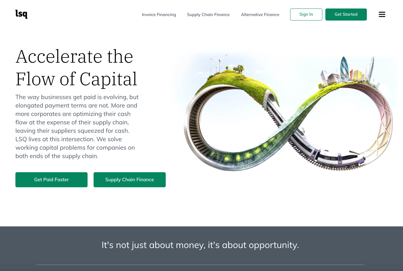
LSQ Funding Group
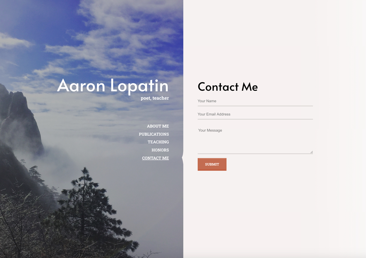
Aaron Lopatin's Professional Portfolio
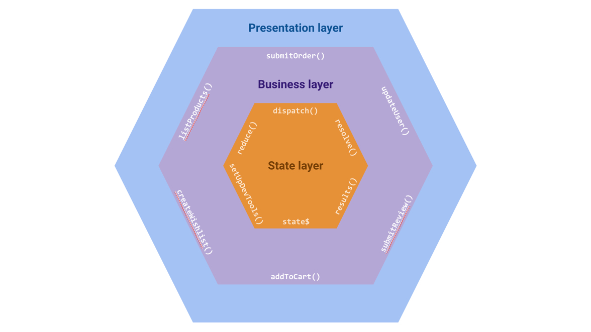
Talk: Using Functional And Object-Oriented Patterns Together For Simple, Modern Web Development
Talk: Node.js + TypeScript
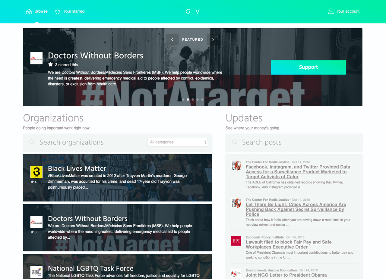
GIV
It's official—Angular is awesome
This is a MEAN stack app, complete with an Angular frontend and an Express/MongoDB backend. Though Angular is the star of the show, giving the app a seamless, single-page experience and elegant frontend code, I'm building out the backend to be production-ready, complete with Amazon cloud storage and content delivery, security middleware, and even a rudimentary recommender.
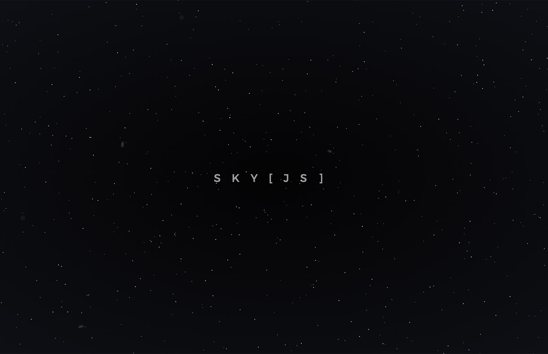
SkyJS
A sky full of stars
SkyJS was my first JavaScript plugin, and the result of years of fascination with both JavaScript and the cosmos. What’s cooler than visualizing yourself soaring through space, past clusters of stars and galaxies? I wanted to bring that fantasy to the web for anyone to play with.
See it on GitHubEsha Shanbhogue
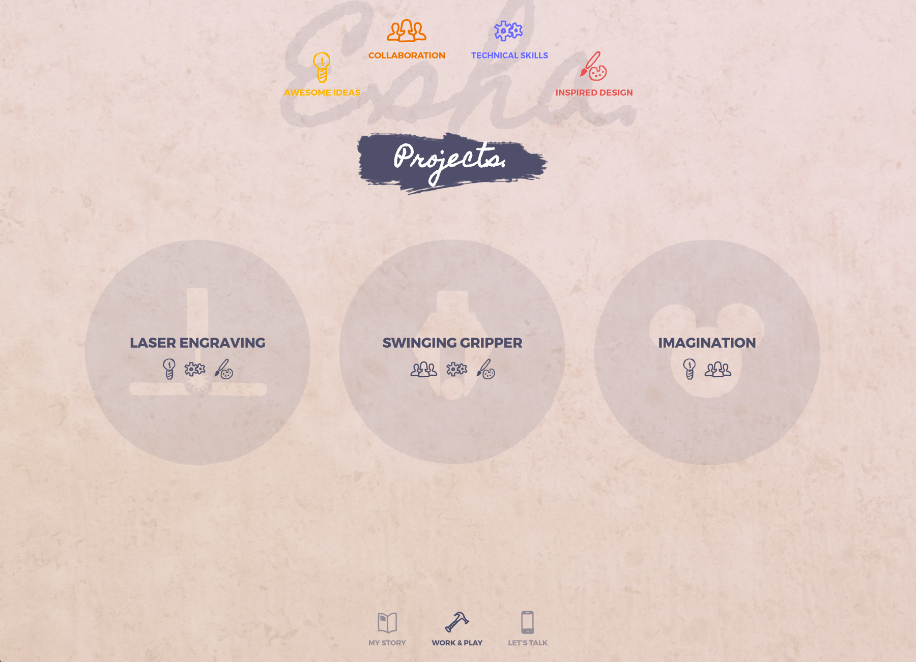
Being a web developer means that your significant other is, at one time or another, going to ask you for a website. And I’m glad she did, because after several weeks of collaboration and iteration, we ended up putting out a pretty cool portfolio site for Esha’s job search.
A grungy, painted look
gets across the idea that Esha isn’t afraid to get her hands dirty.
A single-page site
All the content appears on one page, making the user experience simple and seamless (albeit with some animation lag on older machines). Lazy-loading images keeps page load times nice and short, allowing users to begin interacting with the site while some of the larger images load in the background.
Completely custom
I didn’t feel like a CMS like WordPress was necessary for such a small, highly custom job, but I wanted some scalability and maintainability, so I built the site using PHP, which makes for more DRY (Don’t Repeat Yourself) code and easier editing (though I did not build out a backend UI). All icons and artwork were created by me specially for this site.
Peter Williams
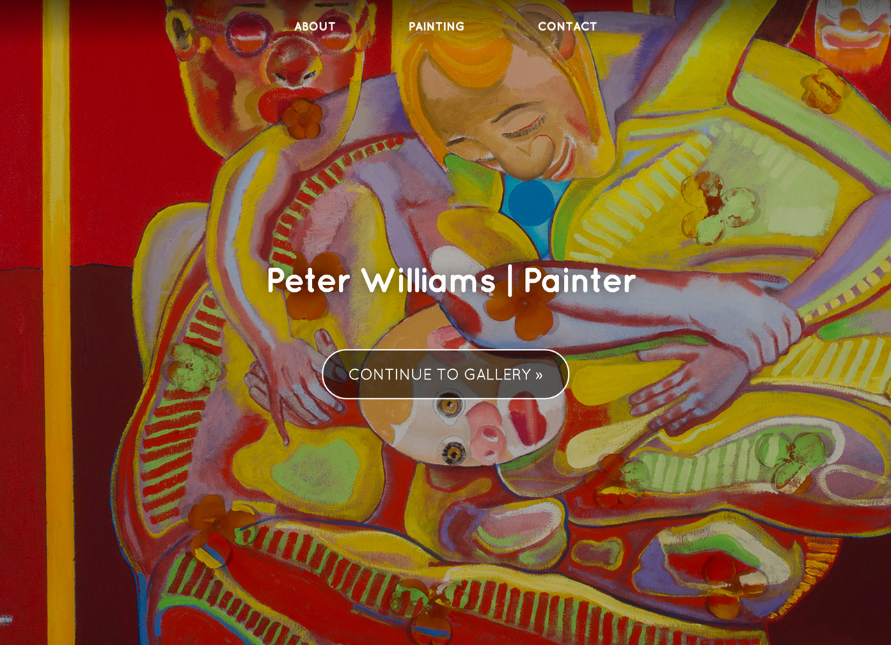
Renowned Delaware painter
and art professor Peter Williams needed a simple, elegant website to act as an archive and gallery of his work. Its minimalism aims to keep the visitor’s attention on the paintings (though Williams’s vibrant style needs no help drawing a viewer’s eye), but I still wanted to give the site itself a style that reflects that of the paintings. Hopefully, the site captures some amount of the color and cheekiness of Williams’s work. What it doesn’t capture is the deeply political, often dark, meaning within his brushstrokes.
Powered by WordPress
and the Portfolio Press theme, the site features custom improvements like a full-screen menu and category navigation on posts.
The Property Exchange Company
Ann Arbor-based Attorney
Karen Mendelson needed a website for her legal business, which deals in something called a 1031 Exchange, the details of which I won’t bore you with—ah, but therein lies the rub. How do you make nap-inducing legalese palattable for a website visitor?
Learn as much or as little as you want
The site is meant to provide as much or as little information as the visitor wants to see. The homepage provides a quick summary with icons as visual aides and clear calls to action. Click on ‘Services’ and you’ll get the full rundown on what a 1031 exchange is and how it works. And, of course, an easily-accessible contact form lets you begin the process right away.
VFly Travels & Tours
As one of my first
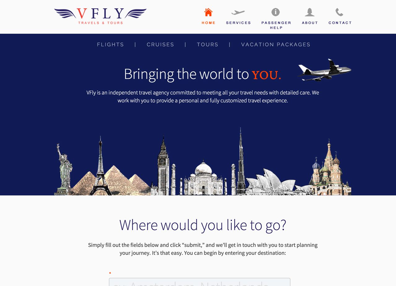
freelance web development gigs, VFly had a very basic user interface that I’m still proud of. While it’s a bit rough around the edges, it actually lets me show off a variety of skills, including illustration, sound web design practices, copy writing and editing, and an ability to work with a client to realize their specific vision. In the age of online bookings, Akila Dharmarajan (VFly’s sole proprietor) wanted her agency to feel as user-friendly as her automated competitors, while highlighting the personal touch that you get with a real-life agent. The ‘Where would you like to go?’ field shows a different popular destination on each page load, and the brief form expands only when the user shows interest by focusing on it. Plug in your travel plans, click ‘send,’ and Akila will give you a call to get your plans rolling, making the travel possibilities feel the way they should: limitless.
 Thanks for the visit.
My name's Danny. I design and build software for the web, and I'm also an advocate for clean software architecture and better web accessibility. I get a lot of joy and pride from the technical and creative work that goes into writing great software. Those skills build on the critical thinking and communication skills I began developing as an English major, and have evolved from designing delightful websites to architecting scalable full-stack applications.
In my free time, I dabble in music composition and graphic design, and I can often be found walking my dog, cooking the perfect cacio e pepe, or coding in an easy chair.
Get in touch
Email's the best way to reach me. Click to reveal my email address.
You can also message me on Linkedin.
